For this project, I have had to learn alot I believe in a very small space of time, that is how it feels to me. Before this project I had never done anything properly to do with animation, we were taught different ways in workshops of how to make animations such as cell animation, after effects, stop motion. I chose to do stop motion with plasticine, and I don't think i realised how difficult it could become, I have seen that some people who also chose to do plasticine at the beginning of the project, but then changed their mind, i was tempted to do this too, but decided that I would try to stick at it, and not to be discouraged by it.
I did encounter a few issues during making me animation, one for example, is as I have mentioned before in my blog, the construction of my plasticine woman, I decided not to make her with a head, as I would only really need the bottom half of her body in the shot, so it would have been pointless, so I just made a headless body really, with arms and legs etc. When i first made her she stood up fine on her own, but eventually began to not be able to stand unaided. So I thought of ways that I could stop her from falling. I thought that the body might have been too heavy so I decided to take off some of the plasticine on her "dress" to reduce the weight of her, which worked slightly, I then redid her legs, which contained wire in them, I thought that increasing the amount of plasticine around the wire may balance out the weight of her dress, I also tried various positions in which the "legs" went into her body, I tried different widths apart, and it helped to balance her out abit too. I reshaped her feet numerous times, trying to make them wide enough and flat enough to support her weight. Making the feet flatter helped to make her stand up for longer lengths of time. However I thought that most of the problem was to do with her legs, maybe the wire? So I had the idea of using drink straws to put in the legs, I thought that I could put the wire through the straws, i believed it would strengthened the legs a little. Doing this technique really helped with the lady's legs, however she wasn't able to stand on her own for really long lengths of time, therefore this caused problems with my desire to have her visually walking in the animation. I tried putting a coat hanger in the top of her torso, but it didnt work, as it bent, So I then tried a pencil, so that I could hold her, move her legs, hold her, take a photo and then readjust her legs again and just keep repeating it, I tried to do this, but because I was trying to take a picture as well as try to hold her in the same position as the previous, I found it really hard, plus my hand cast a shadow over the stage, which made photos different to others. I then just decided to accept that she would not be able to walk within the animation, instead I just made sure that I gave her an effect of "Shuffling" maybe due to the fact, that she appeared to be quite a heavy woman! I think that even though I had this issue, i think that it turned out alright, maybe I would have been able to make her walk if it was a group animation, and there was another pair of hands, it would have been possible. I wish that I had done more experimentation with my animation too, I did shoot it twice, and realised that i didn't have enough footage, i am glad I did this a while before deadline, so that I realised that I had to re-shoot it all. The first run through I too k about 250 pictures, which unfortunately when i put it into aftereffects it came up as 7 seconds of animation. I had to take about 400 more photos to make 20 seconds of footage!
Another issue I had during this project is After Effects, I had difficulty being able to download a trial version of the program so that I could work with it during the Easter Holidays, so this delayed me a little. Fortunately I did end up being able to download one, however, I'm not confident on After Effects and did not enjoy using it, I just didn't seem to be able to anything on it, which is one of the reasons I wanted to do something hand created. For my "Bang!" sign, I suppose that I could have created that in After Effects, but I wanted to stay linked into the whole "hand crafted" style, so thought it would be better to hand illustrate my sign, and shake it to give the effect of a vibration. I do like my sign, but I suppose I could have tried to create it digitally just to see what it would be like.
Because I only had 20 seconds of footage, I wanted to make it longer because our animation was allowed to be 20-30 seconds long. So I decided to make opening and closing credits, I created these by hand drawing a template and then editing it in Photoshop, I really think that these credit frames works successfully, and lengthened my animations to 28 seconds long, which I am pleased with.
I was pleased with my cat model, I think that creating different eyes, and moving the eyes round alot created the sense of sneakiness, which is what I wanted. I think it also added to the humour that I wanted to be there in my animation. I wanted to make a funny animation, something that would amuse it's audience, which is why I decided to make a funny little twist at the end of the cat being hit by the door, because you don't expect it.
One thing that I am quite concerned with it my file size and type I am worried that I have done it wrong, although it says on the brief to hand the file in as a quicktime which is what I have done so, I am just hoping it will be correct, I am also worried because my movie will not play properly when opened from the memory stick that I have put it on, however it works fine on my blog, So I am just hoping it will work fine when it is transferred to the hard drive at university, I am just really concerned with this. I also am worried about my file size, but I am unsure how to change it! :(
Thursday 5 May 2011
Official finished animation
This is my final animation, I'm quite pleased with it, not everything went the way I planned here it is!
It is called Curiousity killed the Cat: Cat Vs Cake. I thought it would be nice to have a title! Also Curious was one of me three words so I think it linked in nicely! I am really plesed with the final outcome just really hope i've done everything correct!
Wednesday 4 May 2011
Credit development.
I was putting my final animation together and I decided that I wasn't too sure on using the photoframe within the credits, I thought that to keep the frame within the animation it would make the text too small, therefore difficult to read during the animation, and the credits are only on screen for about 3 seconds. So I decided that I would cut the frame out and just use the pink and white striped background with the text within, I thought that this would work, seeing as they seemed fine already, the photoframe was really just for decorative purposes, So I edited the frames in photoshop again..


I do quite like them just as the background and the title, I think that the will be easier to resize this way if they need to be.
Final Piece! In progress!
I have now begun to create my animation, I think I am nearly there! I put it all together, the music, the sequence and the credits, and they go together really well! I think my animation is a great fit for the music too, really pleased seeing as this is my first attempt, and I just cannot get on with after effects!
I asked people for their opinion on it, and though i got all positive feedback, it was pointed out that the first opening title wasn't on screen for long enough so you couldnt really read it all, so I think I will work on this! Im still really disappointed that i couldnt make the lady's legs move in the final piece. Really pleased with my idea of using credits, it makes me animation longer which is what i was worried about :)
Titles?
I have successfully shot all of my animation footage! I took in total over 600 photos which is ALOT! so, i put them all into after effects and ran the sequence, it amounted to 20 seconds, which is good because our animation needs to be between 20-30 seconds, but I still thought that it should maybe be longer, so i have been toying with the idea of maybe including credits in it, just to introduce the piece, and then end it, they wont be very intricate, just stating the title and my name, then I was thinking of placing "Fin" at the end, like they do on old fashioned french cinema films, just as a little joke. Make it appear more professional in a purposely mocking way. So I thought of ways that i could create a credit, at first I drew a rectangle on an a4 piece of paper, and then went about ways of trying to make it more interesting and decorated, in the end I ended up with a nice little photo frame. Like so:


this is is just scanned it, i thought it would be quite fancy, So then, once I had scanned it in I opened it up with photoshop, just to colour it etc. I didn't want the inner part of the photoframe to be just one bland colour, so I thought it would be nice to maybe do stripes, so that my font that I put inside the photoframe will stand out more.

ended up with this as the end result after experimenting on photoshop, I quite like the idea of using stripes, especially white with a pale colour, i think it adds enough colour to make it eye catching, but not so much that it's overpowering to the eye. Plus I will want to put font over it too and will probably use black, because it will stand out alot more :)


these are the opening and closing credits for my animation, I'm really pleased with how they have turned out, I think all of the colours go together really well!
EDIT: I have been thinking that i may not include the frame in the final piece, and that I may just put the font on with the nice pink striped background, I think it will still make a successful credit.
Pieces from the sketchbook.
I realised that we don't actually need to make a sketchbook but unfortunately I had already started mine and progressed quite far with it, but because this is a "digital hand in" project, I have taken photos of my sketchbook's contents to post onto my blog.


All of the above are just my design sheets for all of my props, I stuck them in my book for development and research for this project.
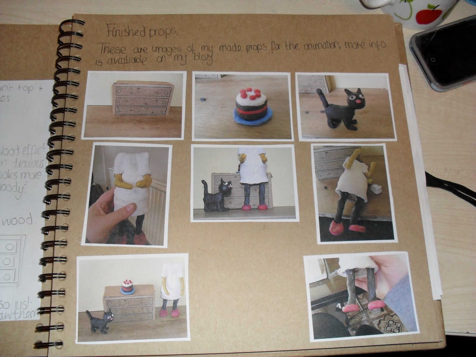
I wanted to include images of my finished models for reference and evidence in my project sketchbook.

This is just about the extra props that i made for my animation.


The above photo is writing about my decision to make credits for my animation.


they are topics that have all already been covered on my blog, but I was using a sketchbook to keep a record of all of the hand drawn objects i had created and all of the learning techniques I had learnt throughout this project.
ideas for my "BANG"
as you will know, my cats going to get hit by the door in my animation, and i want to make a visual bang, i dont really use and effects in after effects for it, because I want to focus mainly on the area of it all being "hand done" so i just want to illustrate my "BANG!" I've been looking at google images for bang signs, just for inspiration and to get a general idea of how they are portrayed...

this one is what i would class as a stereotypical Bang sign, with "hot firery colours" such as reds, yellows and oranges, I think that these are the best, seeing at they are so eye catching and focus your attention.

similar to the colourful ones, this one seems more of a "cuter" design.

this one is simple yet pretty effective...
I found some that where done in black and white, I like this one, but I do think it is a bit of a feeble cloud considering it is supposed to be a "BANG!" just looks a bit like a whoopie cushion.
this one is quite effective, I like the "Spikes" think they give an impression of power and loudness, which is exactly what i consider a bang to be like.

I found a 3D typographical one on my search, I really like this one, because it gives the impression of the BANG expanding and spreading, like the noise of a bang does, makes it seem more impressive.
i think that I will use colour in my bang, and the generic colours of yellow, orange and red, because my "BANG" won't appear for long in the animation, so I want my audience to realise what the symbol means, and I believe that most people relate to the generic hot coloured ones...


this is the logo that i came up with, I like it, I want it to have an illustrated hand drawn obvious effect, seeing as all of my animation was basically hand drawn (except putting it together in after effects) and I want to keep on that type of style for my animation :) I used yellow for the type, and then the inside of the bang cloud was orange, the outside became red, I wanted the intensity of the cloud to be spreading outwards, so I showed this be the shades of colours.
Subscribe to:
Posts (Atom)